Posts

Showing posts from November, 2017

Jim Condron- Picking Up the Pieces

Image
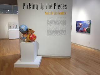
Jim Condron's was extremely confusing and I really had no idea what the meaning was behind his artwork when we first went to see it in the gallery, but after hearing his talk it makes a little more sense. If I am being completely honest I thought the talk was pretty boring and he was a very mundane speaker. But, I found it interesting that he just began to create these "sculptures" and really calls himself a painter. For these reasons he explains that he has yet to perfect the ability to make these "sculptures" on a larger scale and needs to keep them smaller, which is very different from his paintings. He also says that he is not quite yet confident in classifying his artwork as sculptures. Looking at his artwork, I would have never guessed that he strategically puts the pieces together, such as candy wrappers, golf balls, pieces of fur, tennis ball cartons, and that they all have some meaning to his life. The last part that was interesting is that his title

Data Visualization

Image
This reading was very difficult for me to follow and overall just confused me. In Escaping Flatland, Tufte writes about the ways to expand the number of dimensions that can be depicted on plane surfaces and the data density or the amount of information per unit area. I thought the examples of the Java Railroad and the Criminal Activity was interesting to show how certain visual arrangements of different information invites a wide range of ways to detect the patterns that are made to be persuasive and memorable. When looking at information we want something that we are able to think rationally about, communicate and in the end keep what was learned. Tufte writes how "Chartjunk promoters imagine that numbers and details are boring, dull, and tedious, requiring ornament to enliven." This method is meant to make the viewer look from a distance as if the data were a poster. I think this is actually a very interesting way since numbers are often times boring to look at and hard to

Postmodern Visual Analysis

This piece of artwork was made using images on photoshop, paint, ink, marker and magazine cutouts. The composition is very close to being symmetrical and the layout of the piece allows the eye path of the viewer to move from the center, which is the focal point, to each layer that surrounds it. There is both circular and rectangular shapes, which creates a sort of balance and rhythm to the piece. The colors of the painting are warm with mostly an analogous scheme with greens and blues. The denotative meaning of this piece is that there are a collage of different social media and internet mediums slightly deformed being taken in by a black hole. Surrounding this image is a large circle with question marks and around that is a collage of words. The connotation that comes with this piece is a feeling of questioning and reflection. It makes you think about the words that are present and ask yourself how they connect to the message and how much they relate to your life. There is an ideolo